Websites are often the first interaction potential customers will have with your business. This is why it is important to have a site that is not just informative, but also looks good and is easy to use. Things like colour choice, responsiveness, and navigation are just some of the informative factors to consider when designing your website.
Navigation
You could have the best content in the world on a great looking website, but it can be pointless if you haven’t considered the navigation of the site. Users need to be able to move freely around the site easily, being able to find exactly what they want. Dropdown menus are a great way to achieve this, such as this one on A&S Landscape.
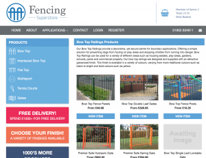
A dropdown menu is a simple, yet effective way to show users everything your site has to offer. For A&S Landscape, their menu is broken down into Sections, Products and Information. This means that if you need inspiration for ‘playground canopies’ for example, you can easily find it, or if you know that the product you need is a ‘Motiva Duo’, you know exactly where to look. The design of this menu means that the site Is easy to navigate for both new and repeat visitors.
Consistency
Creating a cohesive design will really bring your whole website together. Using the same colours, navigation and similar layouts are a great way to ensure you site is consistent. Not only does consistency make your website look more professional, it also means that users become familiar with how the site works, making it easier for them to use.
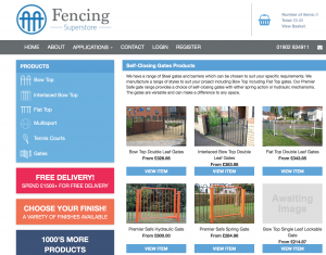
Take The Fencing Superstore website for example. The colours, design, layout and navigation across the pages are appealing the eye and consistent. Using a mixture of layouts and colours can create a confusing user experience, leaving users with a bad impression of your business.
Responsive and Mobile Friendly
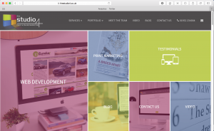
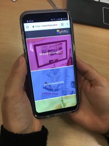
In 2016, 4 out of 5 UK adults owned a smartphone, equating to about 37 million people. Imagine this figure globally! Despite this, many businesses do not have a mobile friendly site. This is alarming considering it was also 2016 in which mobile web searches overtook desktop web searches for the first time. Take our website for example, it is adapted to work well and look good for both desktop and mobile users.
It is also important that your website be responsive. Web visits aren’t as cut and dry as ‘mobile’ and ‘desktop’ visitors. Visits come from people with various browsers, machines, screen sizes, the list goes on. Designing a website on a 27 inch iMac can cause problems if you don’t incorporate that people may view it on a much smaller 13 inch laptop screen. The design must be responsive so that is can stretch or shrink to look good a variety of screens. This can be done in a variety of way, but something like implementing a simple bootstrap grid system can go a long way towards creating a responsive site.
Usability
In everything that you do for your website, you must ask yourself one thing ‘how easy is this site to use?’ If your site is too complex to use or understand, people will get frustrated and leave the site before doing what they needed. For e-Commerce sites this could mean they’d leave before placing a purchase, meaning you would loose out on valuable business. Lets look at the A&S Landscape shop as an example.
This e-commerce site is easy to navigate around, find your desired product, and place your order. It uses a fairly simple design that is familiar for users, making it easy for them to use. As design and web capabilities develop, businesses are looking to develop their sites more and more. While we encourage a modern web design, there is such as thing as overcomplicating a website. It is essential that users feel comfortable using the site, especially e-commerce sites. If users are unsure about the usage of the site, they’re going to feel uneasy about entering their card details, so may place an order elsewhere.

Design Features
Basic design features such as colour choices and layout should be give serious consideration. Selecting colours that complement each other not only improves the look of the site, but can make text much easier to read. Using a small colour palette can ensure your website is consistent across all pages. A select colour palette also means you can create a cohesive design across every aspects of your marketing campaign, be it online or in print. Too many colours can be too distracting and overly stimulating for the user. A great example of this is the Centra Heat website. A few complimenting colours are used across the site, making It both consistent and easy on the eye. Text is easy to read, and is not placed on any harsh backgrounds or images. We hope you’ve found these tips useful, and if you require any more help with your website design, get in touch with us here at The Studio 4.